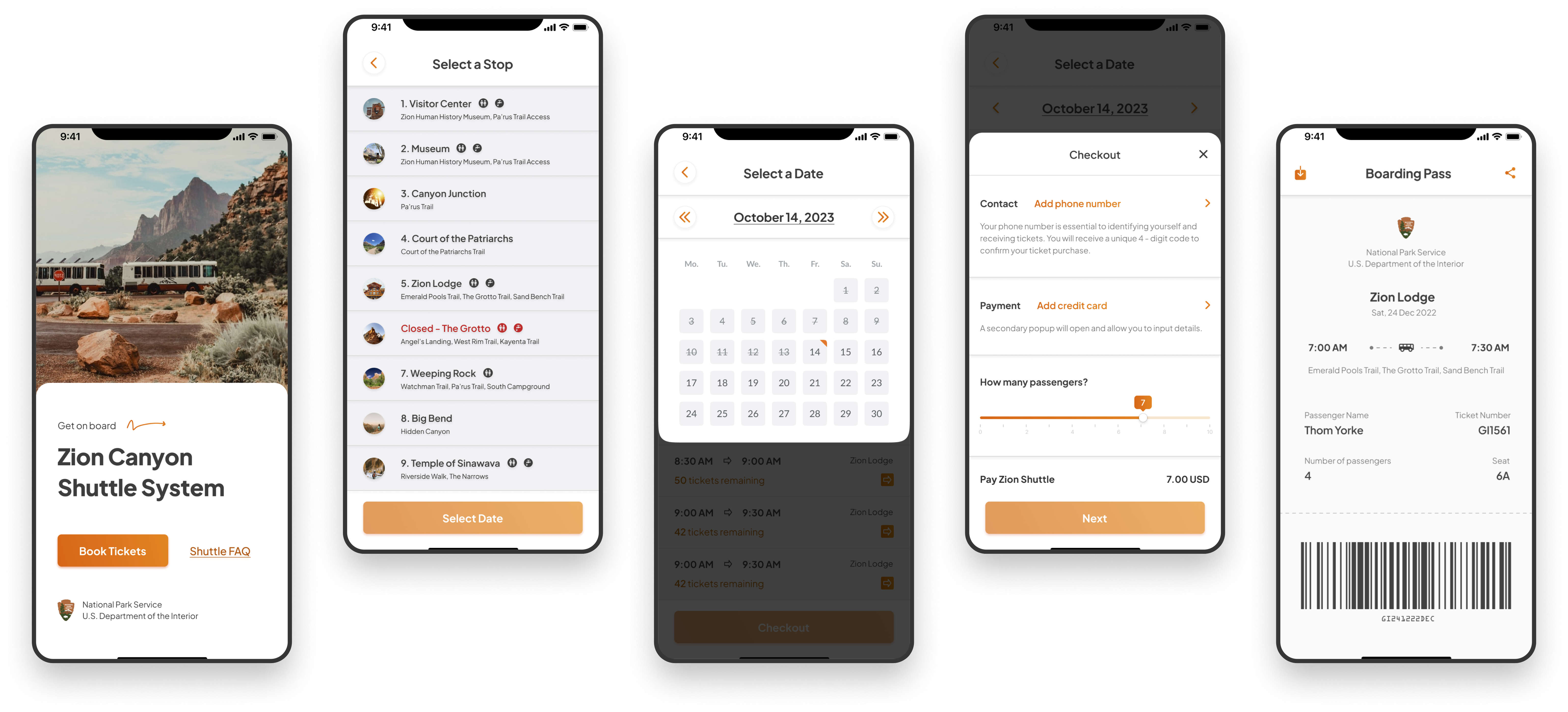

Zion Canyon Shuttle System
iOS, Android, Tablet
UX, UI Components, Prototype
Zion National Park visitors are having their trip negatively affected by a reservation system that is uncohesive and fails to offer a practical solution. My app focuses on simplifying the reservation process to ensure that visitors can easily plan and enjoy their park visit.
As part of the UX design process, I conducted a user research phase to gather insights and identify pain points with the existing web app. To supplement my own observations, I leveraged user reviews as a primary source of user input. By analyzing and synthesizing these reviews, I aimed to corroborate my own findings and ensure a user-centric approach to the digital design.
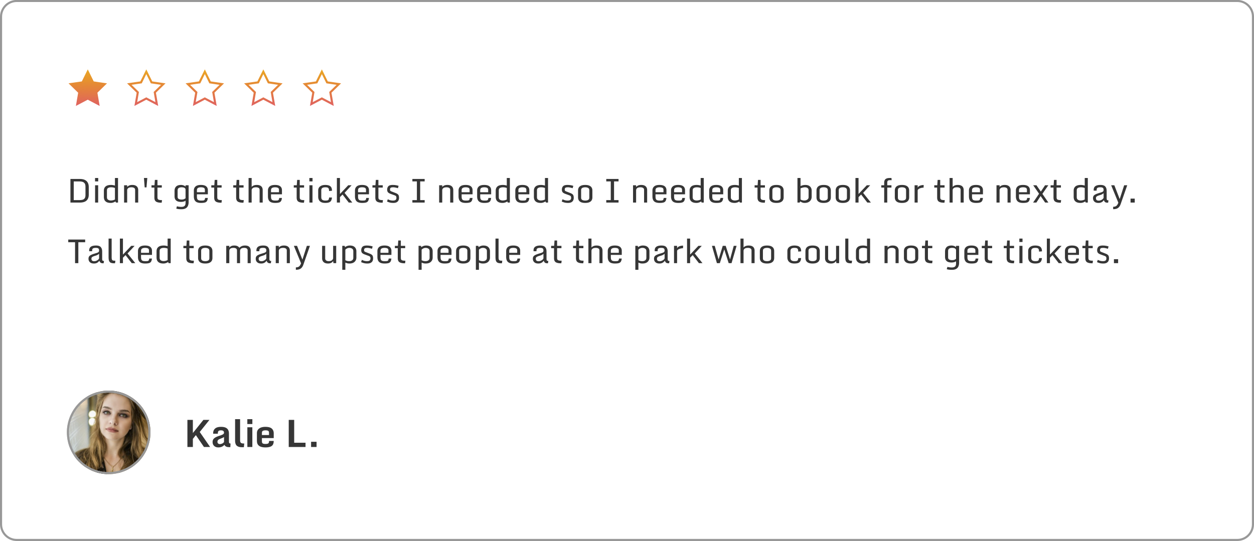
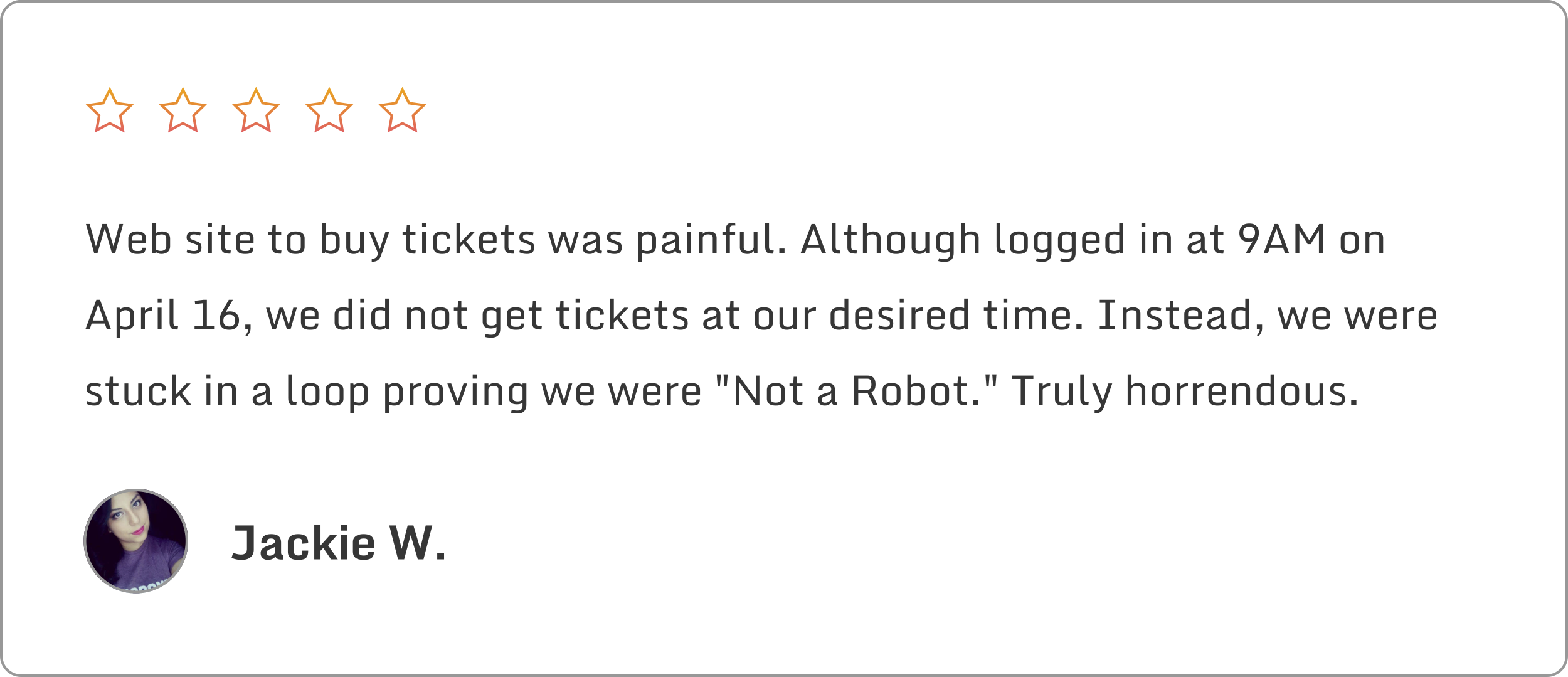
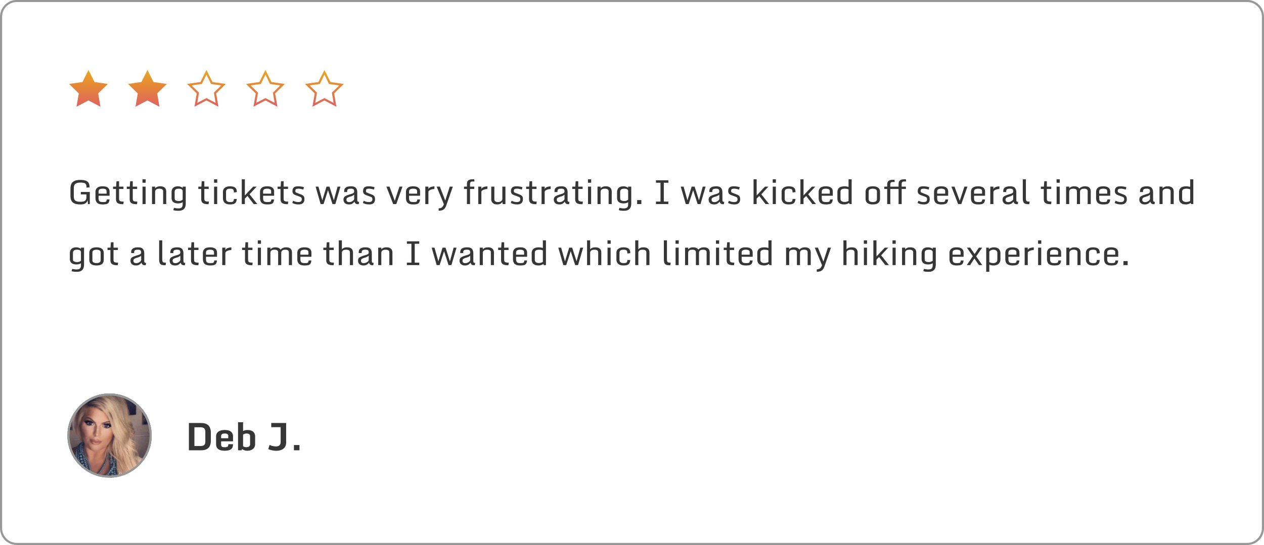
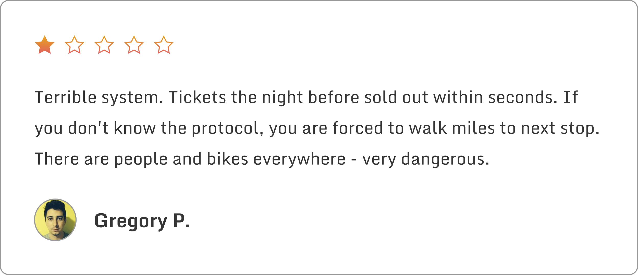
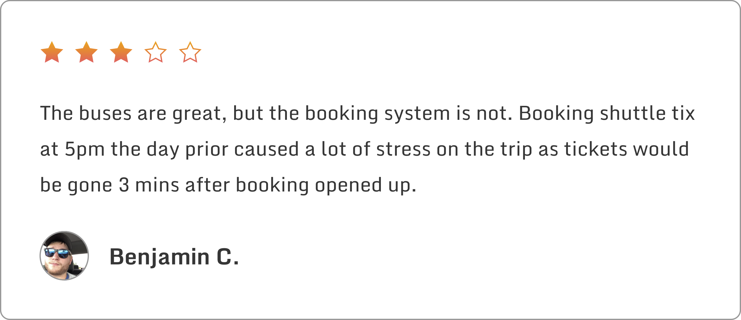
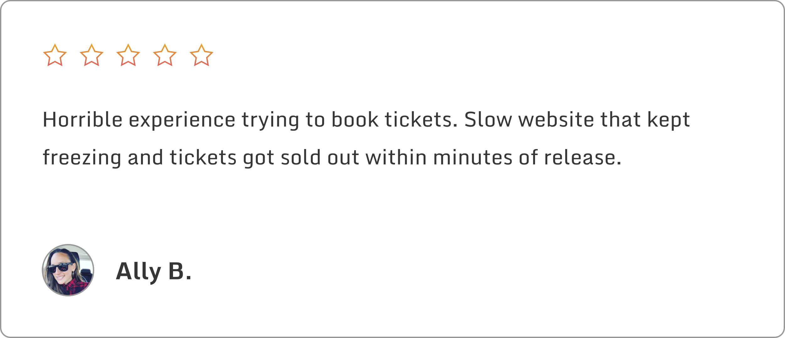
Through this process, I discovered additional concerns that I hadn't previously considered, such as frustration with redundancy and quick sellout times. It was clear that these issues had a negative impact on users' experiences, both in terms of their day hikes and overall trip satisfaction. These insights were invaluable in informing the design decisions that followed, they set up a framework of statements I could iterate on and refine into a user-friendly interface.
Some of the key methodologies are listed below, with explanations as to why they were chosen for this project:
Keeping user pain points in mind, I mapped out an initial flow using some of the initial framework and removing redundancies. Since this would be its own app, I removed the need to search through the park web app for the shuttle section. This set up an easier journey towards a ticket with less touchpoints and more meaningful interactions.
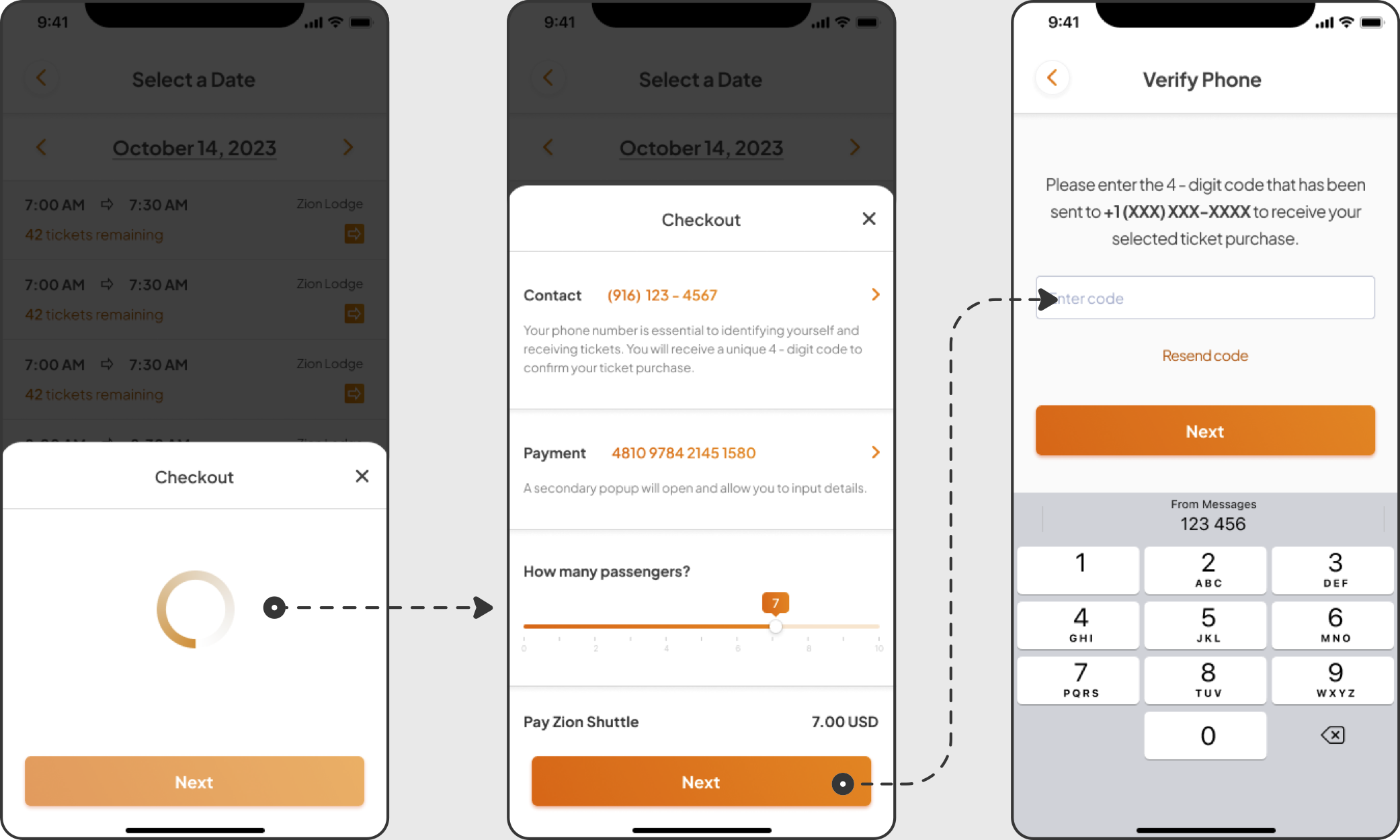
Now that I knew which screens were required, I shifted my focus towards the main components that users would interact with. To enable modular reusability and efficient editing of the design, I used Figma's component properties feature during the design process. Starting from atoms, I built responsive tabs, sliders, buttons, and a calendar that would take user inputs through selection or text. Using this process also ensures the design is optimized for a smooth developer handoff.
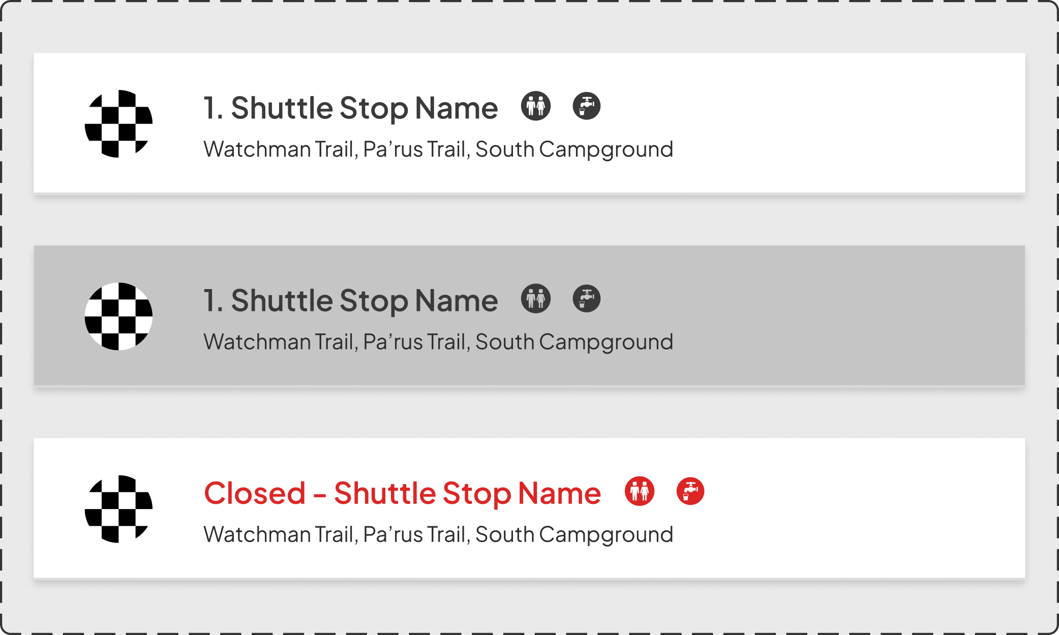
For the UI, I wanted to build my design around a series of questions. How might we:
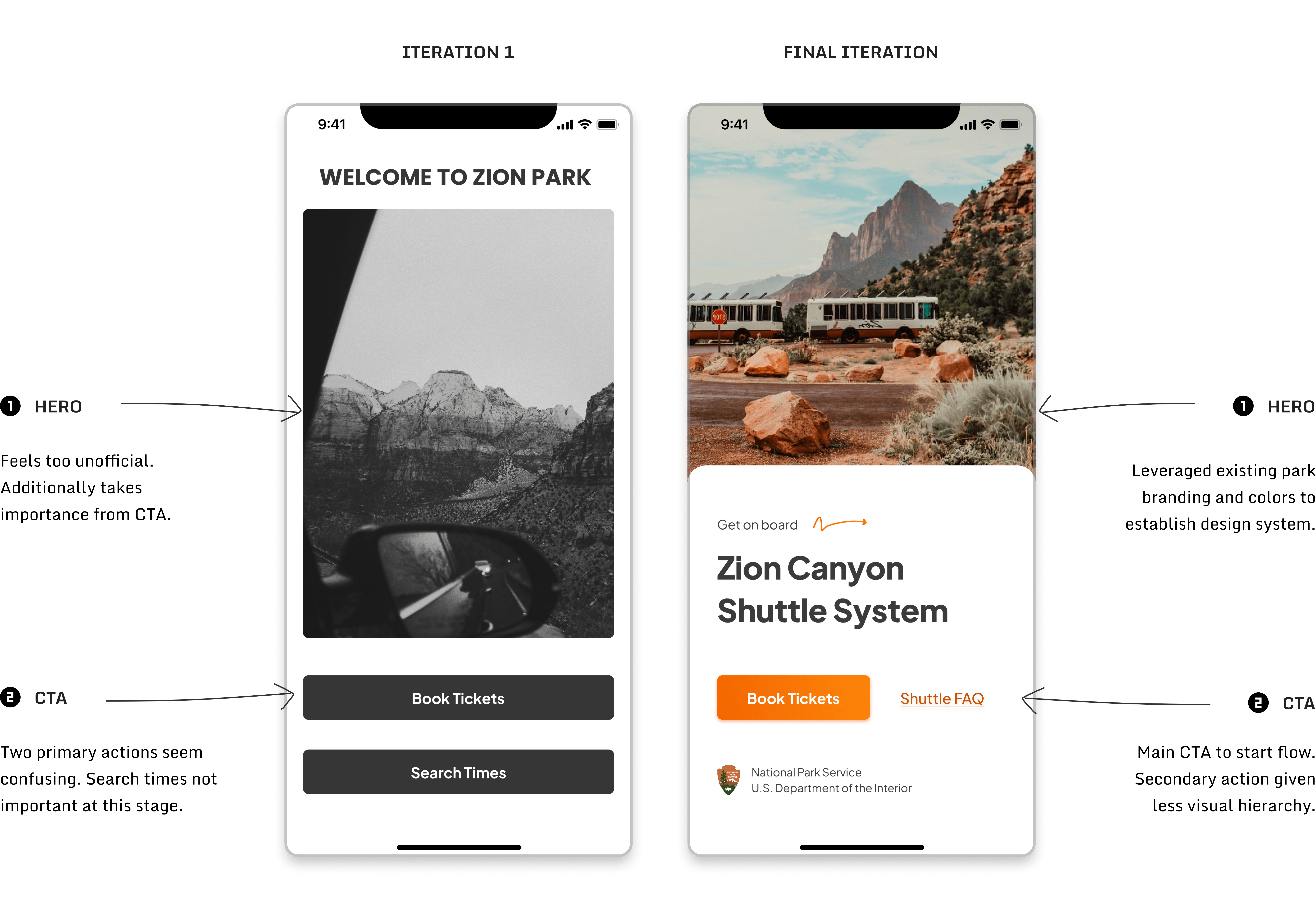
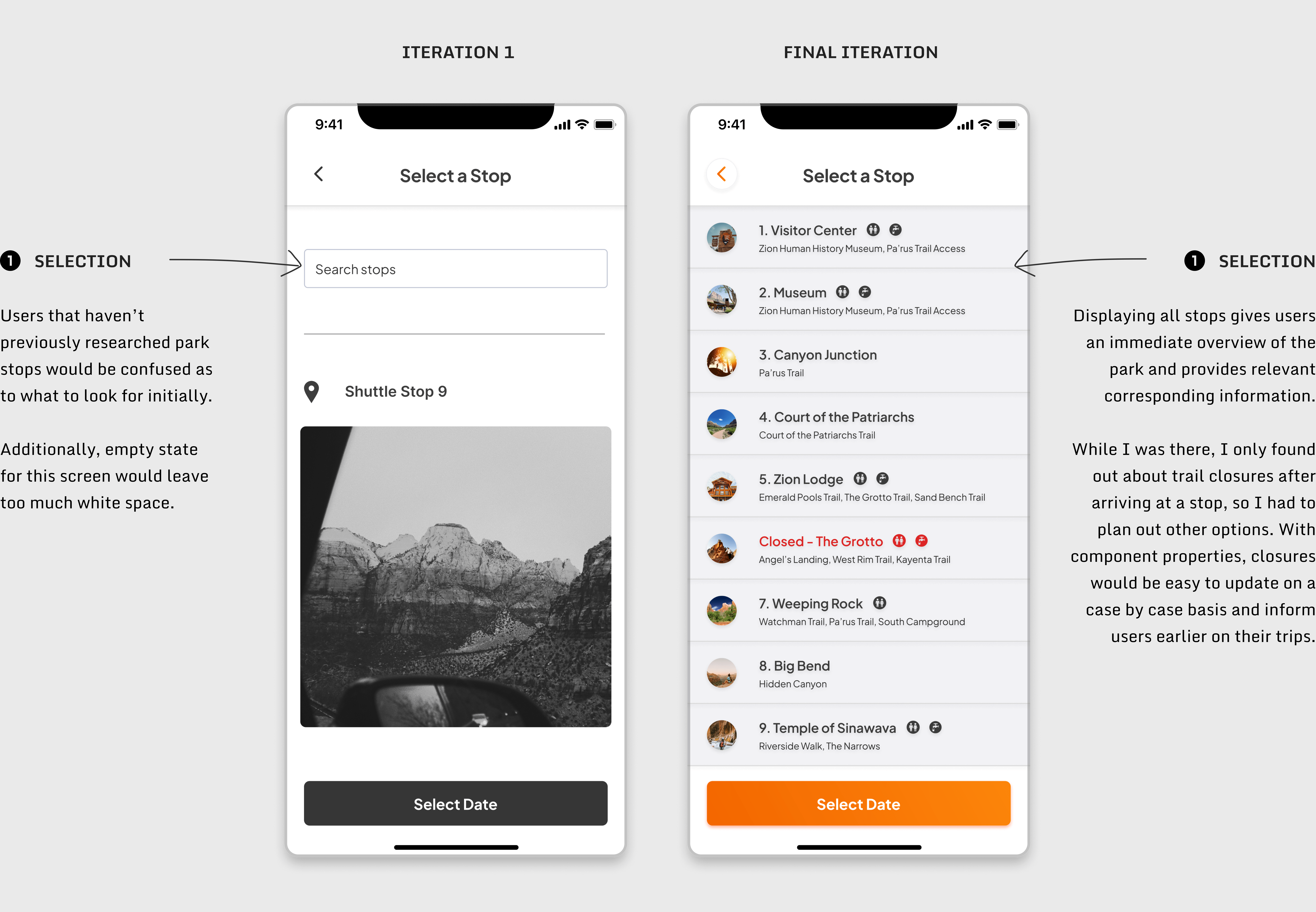
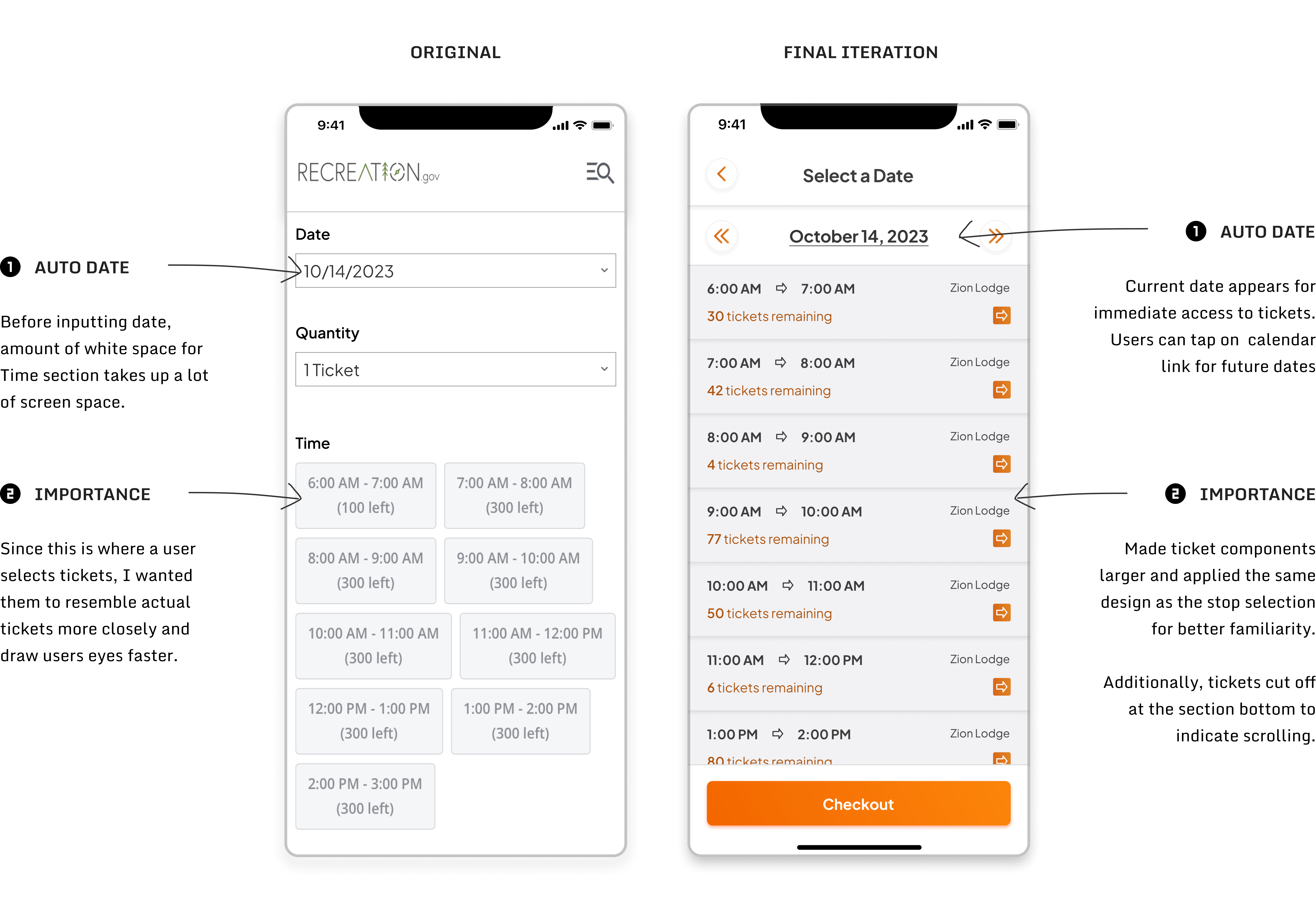
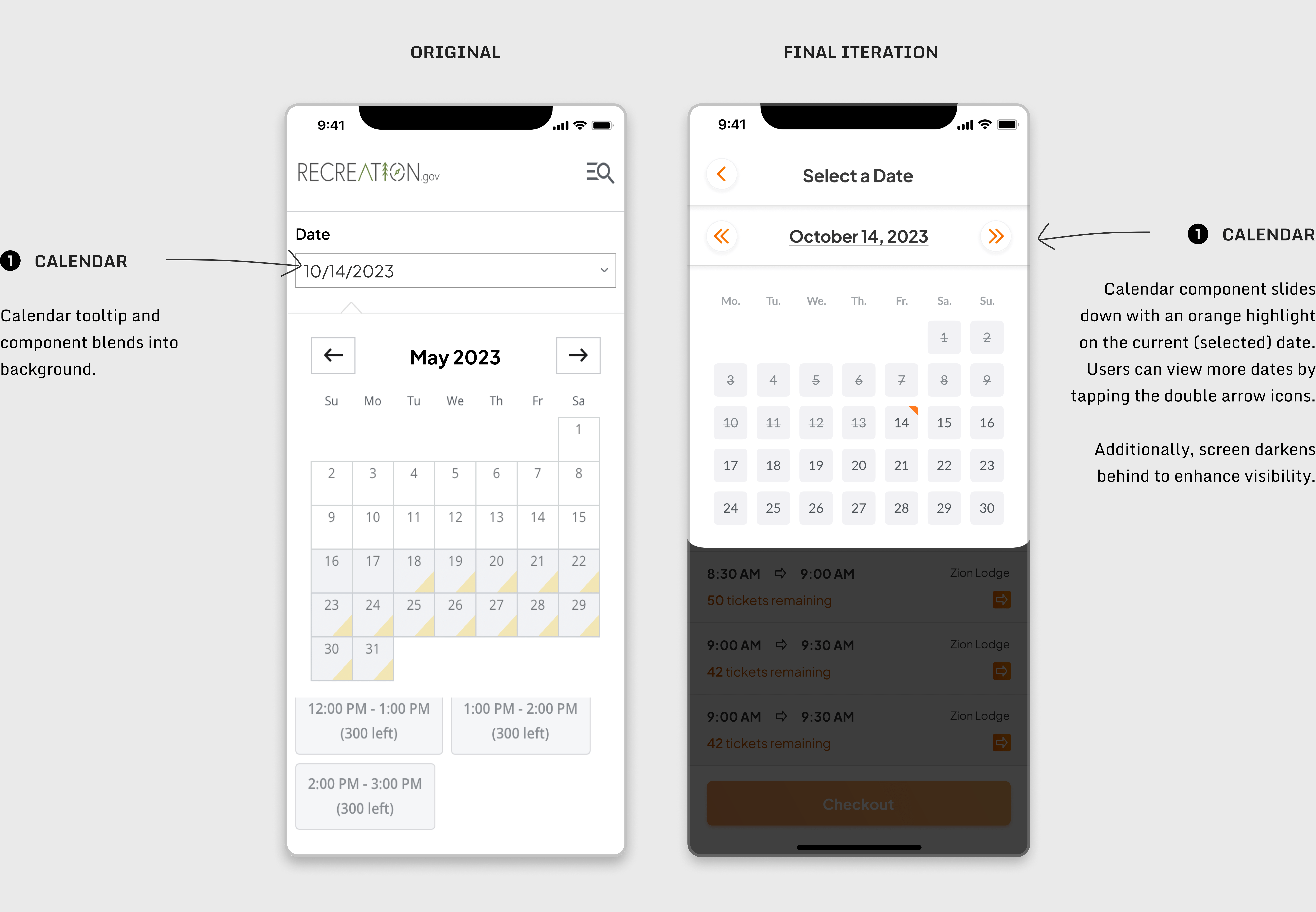
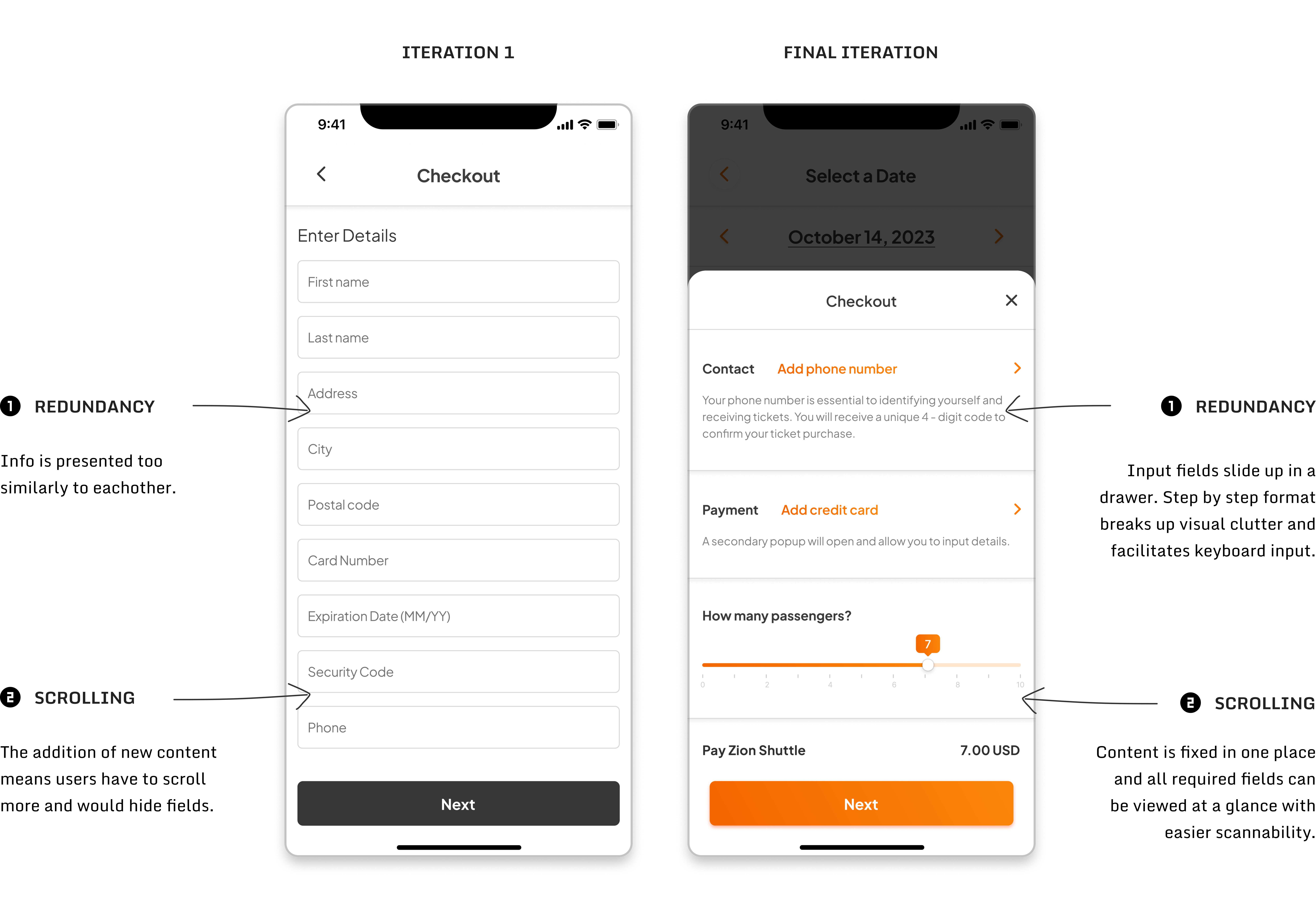
Putting together an app like this was a lot of fun since I worked on solving my own personal issues I and the same many others experienced. If you’d like to check out the full app and its animations & interactions, here’s a link to the prototype.
I think I was able to solidify a better shuttle app core experience to accompany the transportation systems already high value proposition. I focused on the ticketing selection and adding some friction through a checkout/verification process and loading animations, but there are still other directions to update and build upon.