CkMarket Online
An order creation and tasking software that allows kitchen managers to create, assign, and manage tasks for their teams, empowering users to achieve greater productivity each day on the platform.
An order creation and tasking software that allows kitchen managers to create, assign, and manage tasks for their teams, empowering users to achieve greater productivity each day on the platform.
Role
Design Lead
Employer
Capitol Tech Solutions
Platform
Tablet, Web
Areas
UI, Research, IA, UX

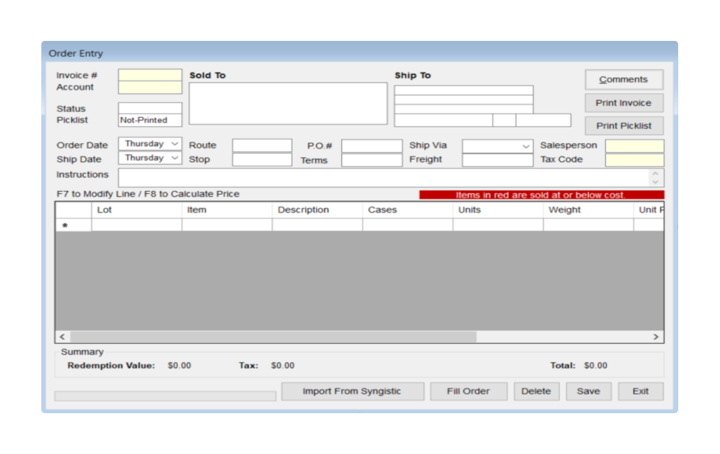
The platform's user-base felt the outdated UI needed a refresh that would allow them to implement new features and screens for their current workflow. The client wanted to increase productivity of their users by by cutting bloated processes through a more consistent and scalable set of designs.
What I Did
Carried out research deliverables, derived actionable steps from research, created a prototype, and finalized design deliverables.
Definition of Done
Combine audience/stakeholder research and testing to deliver a user-optimized set of designs alongside a scalable design library.
Team
One designer (myself) and a software developer.

Understand who their users are, how they work, and what they need day-to-day and long term. Also, audit competitor platforms.
Take learnings and build out new UI, improving interface clarity and accessibility along the way when possible.
After revisions, package components with atomic consideration and deliver updated platform to client.
With tight time constraints, we had just one week for initial research/analysis.
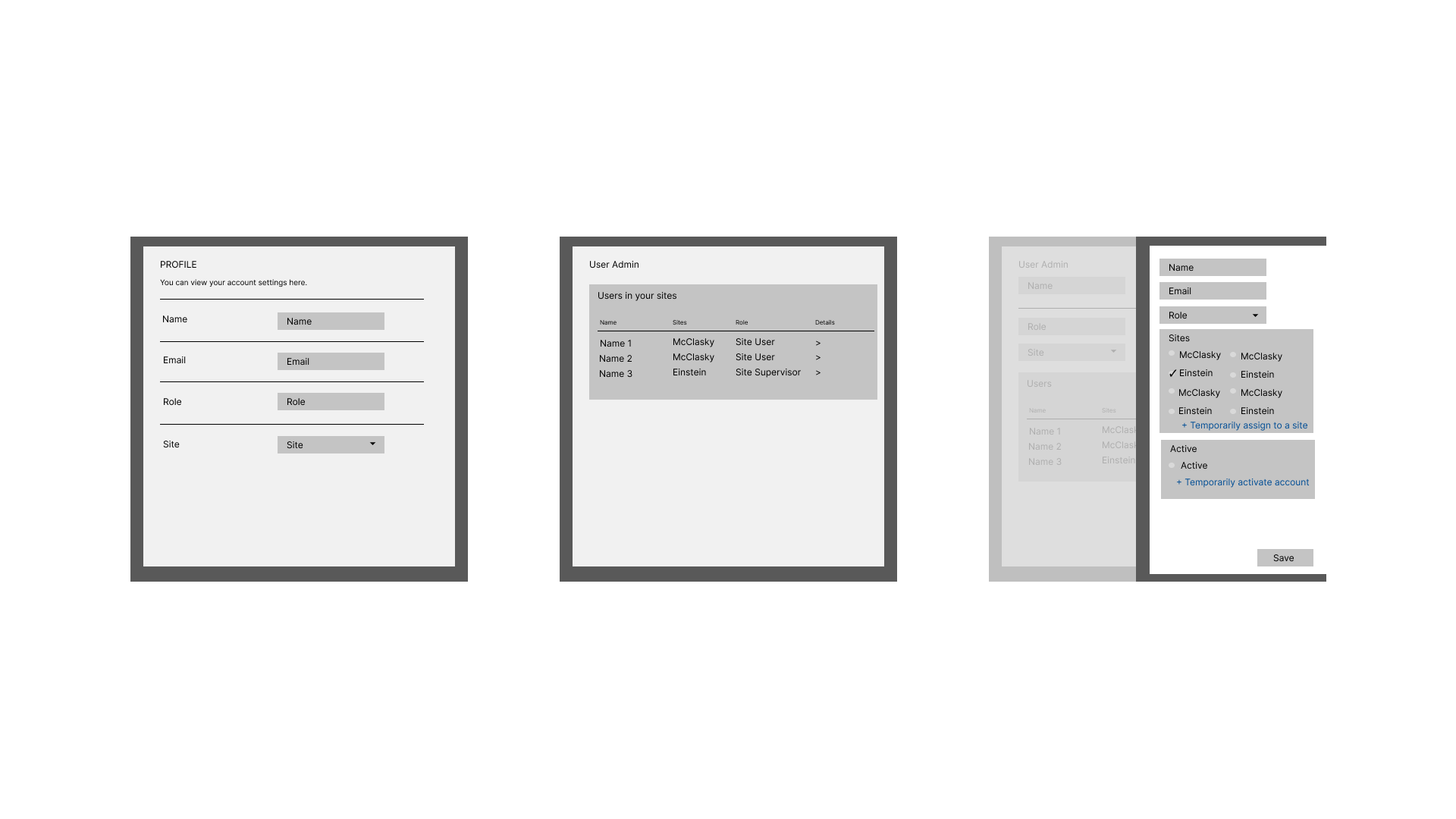
To start, I focused on identifying the key flows within the platform. After two client meetings, I gained a rough understanding of their audience use-cases, determined important pain points (unclear order tracking & inadequate inventory management) and established the platform architecture for my own context.
My research identified two main actors:
"If it's not on my list it's not happening."
The Site Lead is usually the head of a maintenance dept. and reviews orders.
Needs an easier way to create/organize for their team, to search content globally, and to have better awareness of updates to orders as they occur.
"I get in and get out."
Quickly references orders to see if everything matches records provided by site leads.
Some workers will have edit access and may need to update key portions of tasks.

I began collaborating early with the developer to ensure the app’s functionality in the early stages of design. It was important to agree on how the skeleton would work and how components would interact as the product became more robust. Being mindful of pain points, we worked together combining form and function with mock ups in a co-creation environment structured with frequent conversations and check-point meetings.

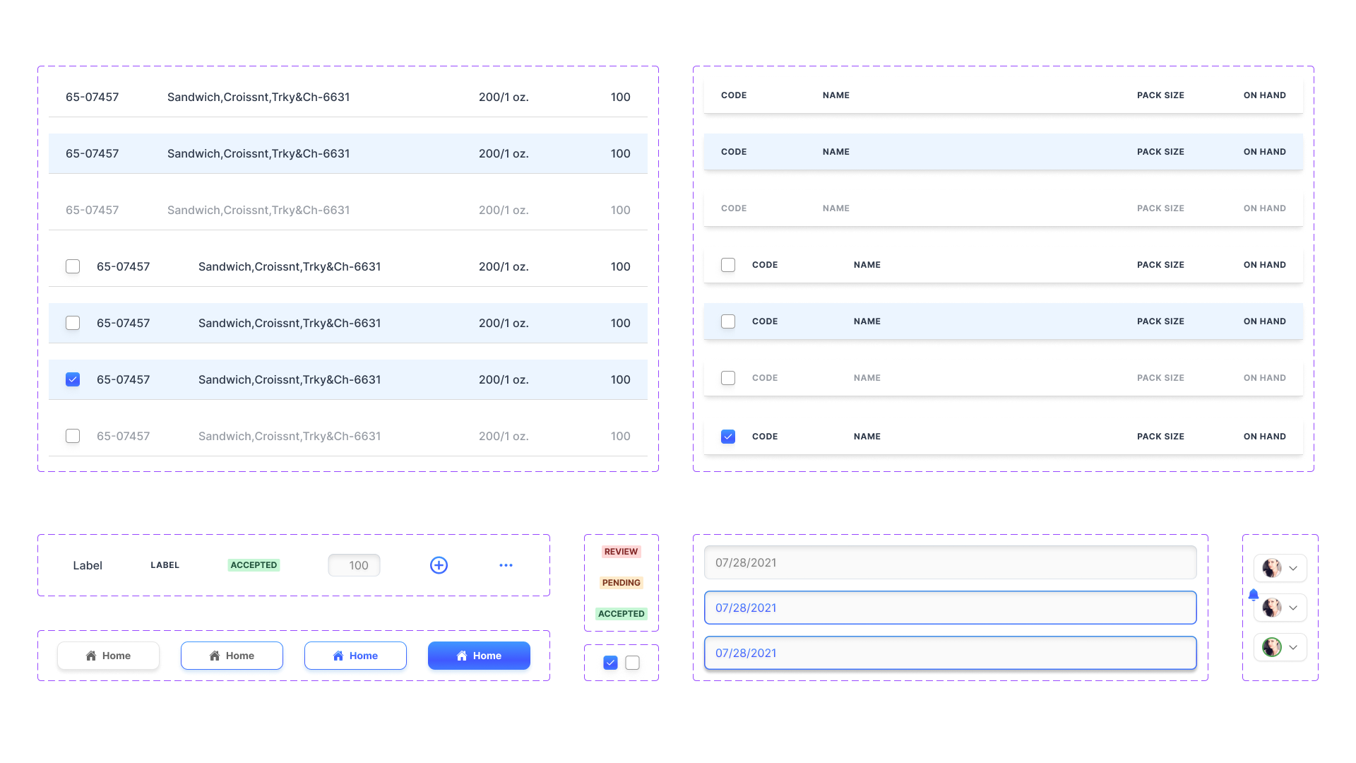
Using atomic design methodology, I created base elements with nested prototype interactions before moving onto more complex components like modals and tables. The design system also includes defined grids built around 8px spacing guidelines that translate to REM units in software development. This was done to influence consistent implementation with the developer, and once established, it expedited hand-off from design to development - cutting down time spent going over design specs.

I took the pain points our audiences identified, mapped where they occurred, and identified key screens that would need to be redesigned to better meet user goals. I then set up a high-fidelity prototype in Figma to aid in end-user meetings/conversations and receive usability insights along the way.
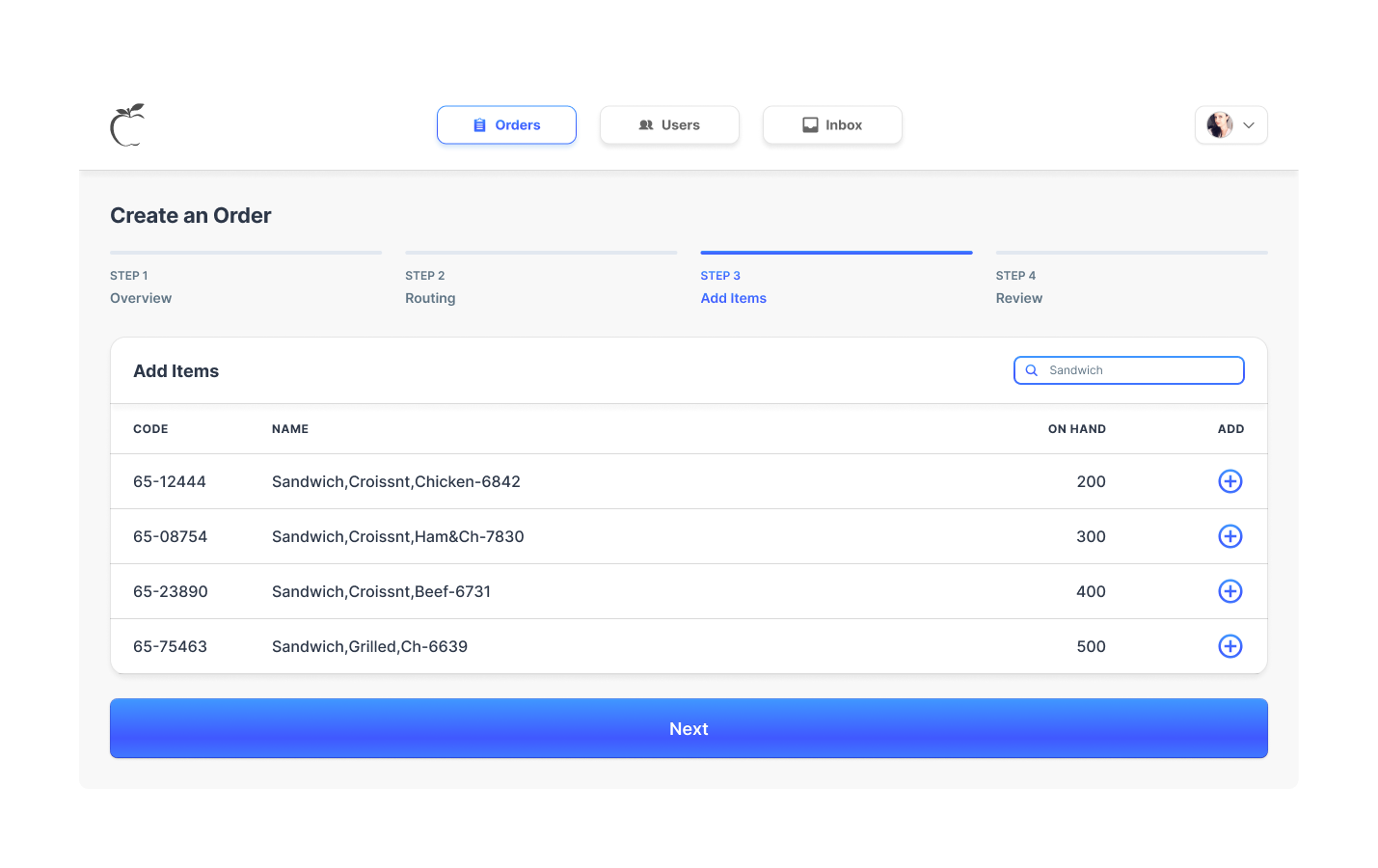
Order Input Modal
New design keeps main user flows and cuts out excess paths and inputs. New additions have clear labels and add functionality to the platform.